Learning When data and a user interact at pace productivity soars.
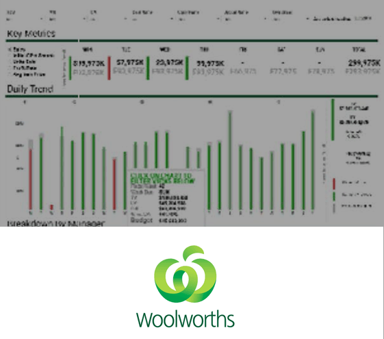
Problem How to empower the buyer team of Woolworths to purchase $40 billion in goods?
Solution A portal with tableau, an app and integrated training.
Success Incredible insights for the ability to drill into data simply.
Methodology We established what is possible using data and world standards. Mapped the available data. Round tables and interviews with buyers to establish what they want and what they need.Drew up designs, working prototypes in tableau, style guides and work on integrative changes to the website. Establish a mobile app for on the go access. Establish a view of how to track customers over time on their sales, profit and volume.

Learning Government can inspire their citizens to action with data.
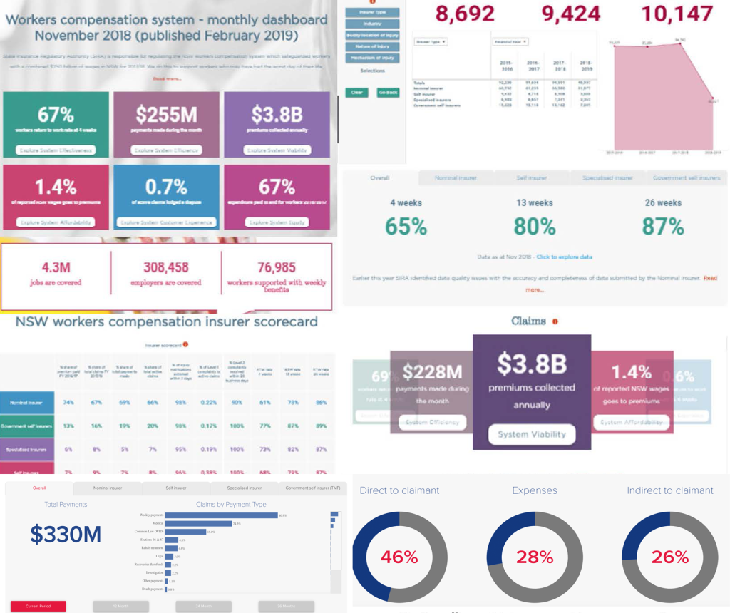
Problem How do you regulate a $3 billion insurance scheme?
Solution A portal with tableau, an app and integrated training.
Success Data inspires action.
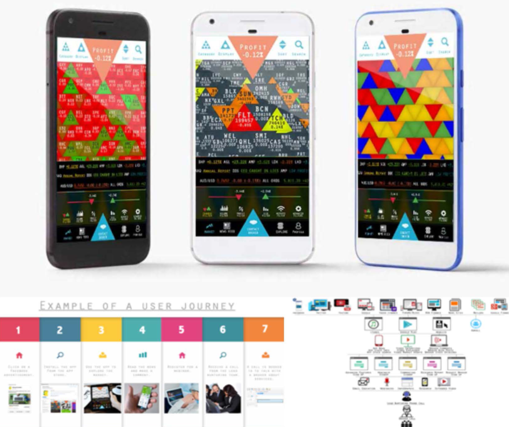
Methodology We established reporting to move from PDF to live data search on a website. Signing off on a database was a big governance step and required the intervention of AI and an analysis engine to find anomalies. The stakeholders need to understand the user journey to finalize agreement. lead us quickly to establish they talk about wanting but won’t pay. This lead to a pilot marketing to gain

Learning Compliance and user research can dovetail into production at the same touch points.
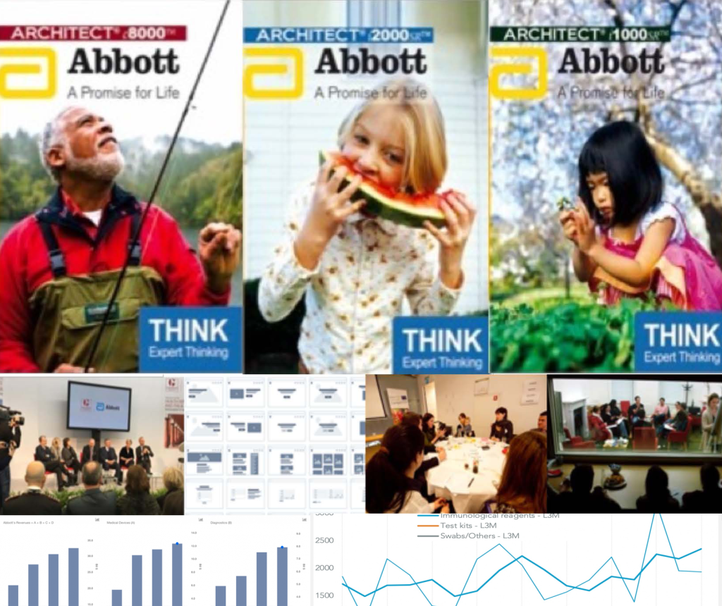
Problem Can you educate the customers of multi-million dollar blood testing machines to use their machines better and fix them themselves?
Solution Online portal for learning about the machine, testing and health.
Success 100% usage across the board with all clients.
Methodology We worked through with the blood testing labs and the engineering teams and establish the major problems and the machines where we can start. We worked through the information that those people were after and streamlined how to deliver. We discovered the issues where primarily seeing someone fix and maintained machines instead of just reading, and establish a brand that would educate on how to make minor

Qantas wanted a more intuitive website for users than it used to be. Hence, we created a scrollable explainerpage page website that animates on the scroll between the 3d, 2d and data. This learning website pages scroll a magical interaction with the website page for understanding complex behaviours.
The UserScience team surveyed the customer base and realised that nobody knew whether an email was read. So we designed a trigger system to send alerts every time someone clicks on an email link. To test this, we called our customers from the list of emails registered for receiving messages and found out which approach worked best – then discussed it with management at Qantas. From these discussions, it became clear what type of new product we should focus on targeting. So we conducted interviews with potential pilots who agreed to be paid for participating and learned that many individuals don’t have brokerage accounts but are interested in opening one.

